
Anatomy of a Pitch Deck: A Practical Guide for Founders
- Lesya Vorona
- Aug 3, 2025
- 13 min read

Updated: Aug 6, 2025
Why this article isn't just another slide checklist
In the fundraising world, we've been conditioned to believe there's a perfect pitch deck. An orderly set of slides that, if followed faithfully, will transform a "maybe" into a "yes". Every accelerator, every fund, every template on the internet repeats the same liturgy:
Problem → Solution → Market → Traction → Ask.
The problem? It only works halfway.
A deck that follows the right structure but says nothing is like a resume full of empty words: polite, orderly, easily ignorable. The point isn't how many slides you have, but what happens in the head of the person reading them.
A pitch deck is an invisible conversation. A silent monologue between you and a person who: reads 20 decks a day, has very little time, is already tired, and knows that 9 times out of 10 it will be a waste of time.
In this article we won't limit ourselves to saying "what to include", but we'll try to understand:
Why does each slide really exist?
What doubts should it resolve?
Why do many pitches say everything, but communicate nothing?
And above all: how do you build a pitch deck that doesn't seem like one of many?
The heart of the pitch: not a structure, but a tension
A pitch deck isn't a format to fill in, but a narrative arc to construct. The person looking at your deck doesn't need an orderly sequence of slides: they need a reason to keep reading.
And this reason is always the same:
"Could this thing work?" → And therefore: "Is it worth investigating further?"
Everything else, the form, the data, the design, is secondary. It only serves to support a central tension: generating curiosity, credibility and desire to know more.
Attention: the investor's logic isn't yours
You might want to explain everything. You want to tell about the product, the values, your story, the design, the feedback received, why you believe in this vision. But the reader has only one question in mind:
"Does it make sense to dedicate time, energy, capital or attention to this?"
90% of pitches fail here: they never answer this question.
Here's why the "perfect" structure often doesn't work
Not because it's wrong. But because most founders use it as a container to fill, instead of a path to build. Slide after slide, the reader should:
Understand who this thing is for
Feel what problem it solves, and why now
Think "interesting: I want to understand how"
Arrive at the end with a precise feeling:
"This thing is serious. I need to talk to them."
A golden rule: don't convince, but orient
Your goal isn't to close an investment in 12 slides. It's to generate a "follow-up". A call. A deeper look. A connection. A second-level decision.
You need to leave marks, not exhaustive explanations.
Slide 1 - Title & Tagline
Real function: Make yourself understood immediately. Anyone looking at the deck should know, within 5 seconds, what you do, for whom and why you exist.
Common error: Vague, descriptive or self-referential titles. A subtitle like "Reinventing the future of productivity" says nothing. Even "AI Platform for the future of work" is noise.
What really works: A synthetic and positioning tagline, containing at least 2 of these 3 things:
The target audience
The action or benefit
A distinctive element
Examples that work:
"Notion -- The all-in-one workspace for your notes, tasks, wikis, and databases."
"Plaid -- Infrastructure for financial technology applications."
"Superhuman -- The fastest email experience ever made."
Source: Guy Kawasaki, Stanford -- "If I don't understand what you do in 10 seconds, I won't read the rest." Y Combinator also recommends starting decks with: "What do you do?"
Slide 2 - The Problem
Real function: Make the reader feel the discomfort or inefficiency that your product solves. It must be urgent, real, and recognizable by anyone.
Common error: Slide full of abstract data (e.g. "the logistics market is worth $1.2T") or generic statements ("time is the scarcest resource" = fluff).
What really works:
A concrete case: "Jessica, 34 years old, HR manager, spends 9 hours a month searching for CVs on 5 different platforms."
A phrase heard from users
An observable tension supported by statistics, not theorized
Source: First Round Capital -- "Start with a customer insight, not a statistic." According to Crunchbase, 57% of investors discard a startup if the problem isn't clear and differentiating.

Slide 3 - The Solution
Real function: Make people understand, simply, how you solve the problem and why you're better.
Common error: Vague descriptions, technical jargon, 4 generic bullet points about features. Or: "Our platform...", without context.
What really works:
A clear value proposition ("Save 70% of time with 1 click")
1 sentence + 1 clear image or mockup
Show how the user's life changes, not just what the tool does
Source: YC & a16z -- "Explain it like you're pitching to your smart but non-technical friend." Marc Andreessen: "The solution must feel inevitable, not just interesting."

Slide 4 - Why Now
Real function: Answer the question: "Why right now?" Timing is often the real difference between a good idea that flies... and one that stays in the drawer.
Common error: Telling a generic trend ("the world is becoming increasingly digital") or using buzzwords ("AI is revolutionizing everything") without connecting them to your case.
What really works:
A concrete change: technological, regulatory, cultural
A temporal opportunity: a window open today that might close
An inflection point (e.g. "the pandemic changed the habits of X")
Source: BCG Global Reports 2025 -- "Winning pitches know how to identify structural trends, not passing phases." McKinsey 2025: market timing is one of the top 3 success factors in VC evaluation.
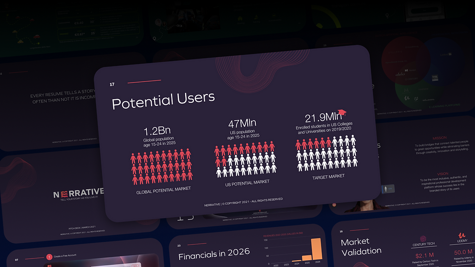
Slide 5 - The Market
Real function: Show that there exists a large and concrete economic opportunity. It's not enough for the idea to be useful: it must be able to generate returns in a scalable way.
Common error:
Unverified (or inflated) TAM/SAM/SOM projections
Using consulting firm slides without understanding what they mean
Presenting a $100B market... but without saying which slice you can really serve in the first 2 years
What really works:
A credible market, with sourced and realistic numbers
Focus on the beachhead market (first servable segment)
Show why you're positioned to capture it better than others
Source: Sequoia --"The market matters more than the product, because a great market pulls a mediocre product, but not vice versa." YC advises avoiding fictitious estimates: "Don't invent TAM. Describe where you start, and why that's a good beachhead."
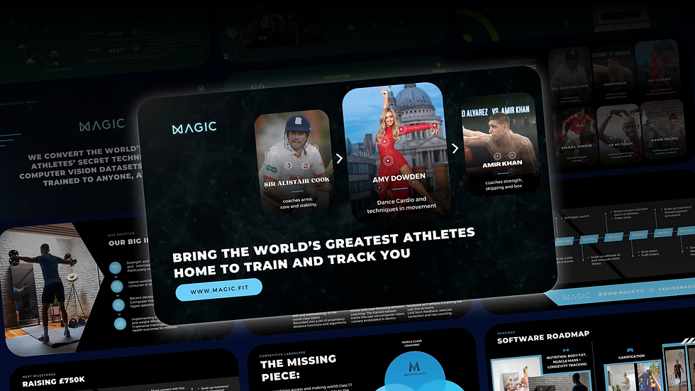
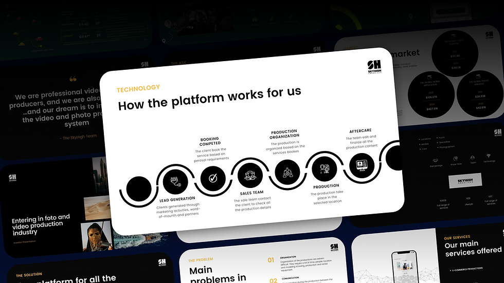
Slide 6 - The Product
Real function: Transform an abstract idea into something tangible. Give shape, concreteness, vision.
Common error:
Confusing screenshots
Long explanations without demos
Words like "intuitive", "intelligent", "scalable" without proof
What really works:
1 or 2 highly readable images (not 5 small screenshots)
A link to a brief demo or explanatory video
If you don't have a product yet: wireframe + user narration (e.g. "Luca enters → searches X → gets Y in 30 seconds")
Source: First Round -- "Show, don't tell. Investors don't want to imagine what you're building. They want to see it." McKinsey 2025: investors prefer concrete MVP to futuristic visions.
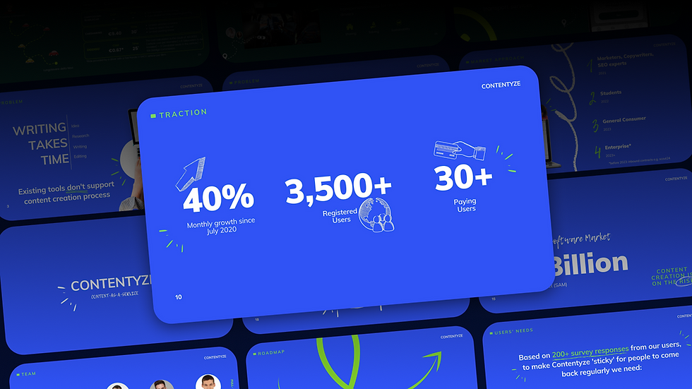
Slide 7 - Traction
Real function: Show that the model is starting to work. This serves to build trust: from data to actions.
Common error:
Shooting vanity metrics: registered users, Instagram likes, time spent on page...
Showing a growing curve... but not explaining what is growing or why
What really works:
Metrics that demonstrate engagement, retention, revenue or repeat usage
Something that shows momentum (e.g. "+63% MoM in active users since January")
Alternatively: validation proxies (e.g. pre-orders, waitlist, signed partnerships, A/B test results)
Source: a16z -- "Traction isn't about size, it's about signal. Show that the market wants what you're building." TechCrunch Q1 2025: startups with documented traction are twice as likely to get a first round.
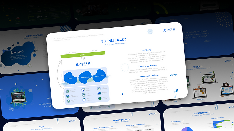
Slide 8 - Business Model
Real function: Make people understand how you'll make money, in a sustainable and scalable way. And that there are margins to stay afloat.
Common error:
Tables full of numbers without context
Pricing thrown out there ("freemium, then SaaS at €9/month")
No growth or scale logic → just "user → revenue"
What really works:
Show how you monetize today and tomorrow
Explain why it's replicable/scalable
Include unit economics if possible (e.g. CAC vs LTV, margin per SKU, fixed vs variable costs)
Source: Sequoia -- "Your business model is your product too." Harvard Business Review -- "Investors don't want ideas that will one day make money. They want models that show how money is made now."
Slide 9 - Competitors & Competitive Advantage
Real function: Show that you know the playing field and that you have a distinctive edge. An investor must understand where you position yourself --- and why you're not easily replicable.
Common error:
2×2 matrix with you in the top right... without logic
Saying "we have no competitors" (doesn't exist)
Making a list of companies without explaining how you differentiate
What really works:
Show real alternatives: both direct and indirect
Highlight barriers to entry: technology, community, network, proprietary data, UX, execution
Show why you are better for a specific segment, not absolutely
Source: Y Combinator -- "If you can't explain your edge, you don't have one." a16z -- "Great founders obsess over the competitive landscape and still know how to play offense."

Slide 10 - The Team
Real function: Convince the reader that you're capable of executing. In early-stage, the investor often invests more in the team than in the idea.
Common error:
Impersonal and depersonalized CVs (e.g. "10 years in consulting")
Slide full of non-operational advisors
Team with little cohesion or without focus on complementarity
What really works:
Relevant backgrounds aligned with the challenge
Highlight track record, even small but significant
Show who does what, who is full-time, who is committed
Source: Guy Kawasaki -- "If your CEO can't pitch and cover all core slides, you need a new CEO." First Round Capital -- "People invest in people who've done the hard thing before --- or show they're obsessed enough to learn come hell or high water."
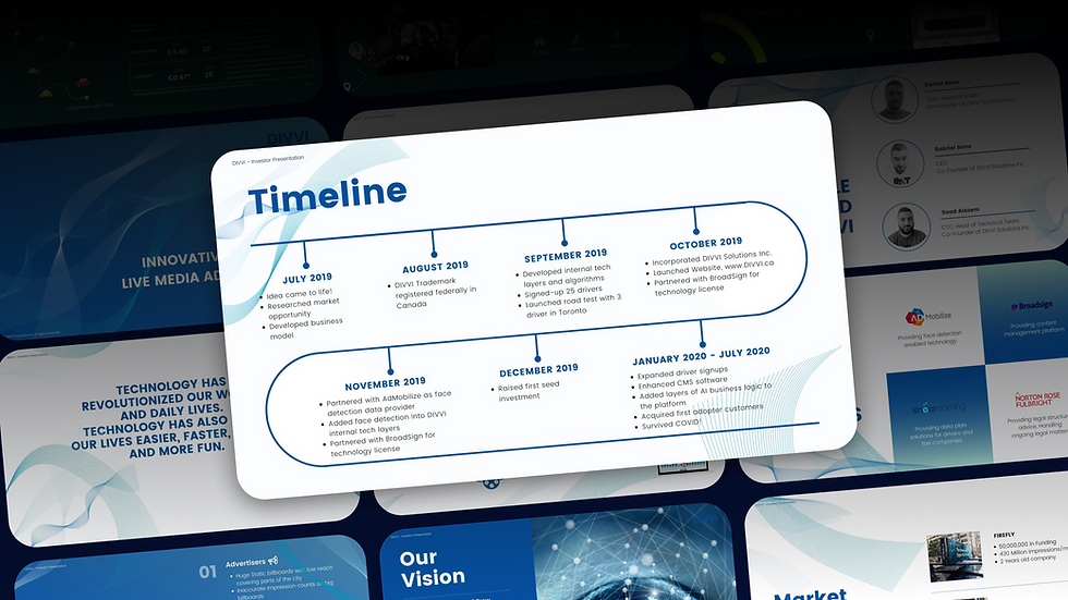
Slide 11 - Financials & Roadmap
Real function: Show that you know where you're going, with credible numbers and precise milestones. They don't have to be perfect --- but they have to be thoughtful and coherent.
Common error:
Absurd forecasts (e.g. +1000% revenue year 1, 80% margins)
Absence of marketing or R&D spending
Roadmap too vague ("global expansion Q3") or too technical
What really works:
12--24 month forecast with explainable assumptions
Roadmap with clear milestones: versions, user acquisitions, future funding rounds
Consistency between financial plan and business model
Source: McKinsey 2025 -- "Investors reward founders who show mastery of execution and capital efficiency." Sifted 2025 -- early-stage rounds with milestone-based roadmaps raise 30% more on average.
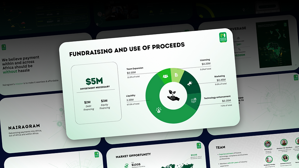
Slide 12 - The Ask
Real function: Declare how much you're asking for, in what form, and what you'll do with it. This is the moment to be concrete.
Common error:
Asking for "between 300k and 1M" (not serious)
No logic in fund usage
Already talking about exit or IPO (it's too early)
What really works:
A precise amount (e.g. "Raise: €600k pre-seed round")
Clear breakdown: % for product, team, go-to-market
Optional but strong: connection between requested funds and future milestones
Source: YC -- "Be clear. Be direct. Show exactly how money turns into growth." Harvard Business Review -- pitches that don't follow up within 24h of sending the deck lose 70% of their chances to continue.
What you can avoid (even if they tell you no)
The startup world is full of "must haves" --- slides you must insert, formulas that everyone follows, checklists to complete to feel "in order". But the truth is this:
A pitch deck isn't a test to pass. It's a message to deliver.
And sometimes, to really deliver it, you have to remove.
1. Don't have traction yet? Don't fake it.
Many founders feel the need to put a traction slide even when... they don't have it. The result? Forced metrics, weak numbers, and a worse impression than you would have made without.
Better to say: "We're still testing hypothesis A with 2 early adopters" than "+30% week-over-week clicks on a landing with 7 active users"
VC tip: experienced investors know how to distinguish real traction from fluff. They reward strategic honesty.
2. Why now isn't always mandatory
If your timing is self-explanatory (e.g. a just-approved regulation, or a global crisis that created a market void), you don't need a dedicated "Why now" slide. You can integrate it into the problem or market section.
Better to use an extra slide for the product or vision, if these are your real strengths.
Source: BCG, 2025 -- "In pre-product startups, solution uniqueness matters more than the trend that justifies it."
3. The market doesn't need to be quantified at all costs
Sometimes your market doesn't exist yet, or consists of behaviors not yet monetized. In these cases, forcing a TAM/SAM/SOM makes you lose credibility.
Better: "Our market today is latent. We're inspired by X (comparable), but we believe a new category will emerge driven by these three trends."
Source: Andreessen Horowitz -- "Category-creating startups create markets, they don't quantify them in advance."
4. Financials and roadmap in pre-seed? Only if they serve a purpose
If you're in very early stage, and you're only looking for a few months of runway to build the product, you don't need to insert a 3-year forecast. It will be fake, and everyone knows it.
Better a clear 6--12 month roadmap, with product, team and go-to-market milestones. The right message is: "Here's what we need to go from idea to validation, and why we'll succeed with these funds."
Source: Seedcamp -- "Early stage means clarity of execution, not revenue projections."
5. Exit strategy isn't a strategy
Talking about exit in the first round is often counterproductive. Investors want to understand how obsessed you are with the problem, not how much you want to sell your company.
The only context where it makes sense to discuss it:
If you're in an M&A-driven market
If there are recent and frequent comparable exits
If it's part of your GTM strategy (e.g. plugin for a giant SaaS that often acquires)
Source: YC -- "Don't talk about exit unless your business is literally built for it."
In summary:
Slides don't serve to fill space. They serve to transmit information that shifts perception. If a slide doesn't change anything in the person looking at it, it's better to eliminate it.
Design, but not for aesthetics
Many founders believe design serves to make the deck "beautiful". Clean lines. Elegant fonts. Harmonious colors. Yet, the truth is this:
Design doesn't serve to make you look good. It serves to not get you ignored.
A "beautiful but confusing" deck gets closed. A "clear but ugly" deck gets read. But a clear and polished deck enters the mind --- and stays there.
The design has one goal: to be read effortlessly
Someone opening a deck doesn't have time. They have two seconds to decide: read or skip? And they decide based on:
how much they can orient themselves at a glance
how readable the primary message of each slide is
how much everything "flows" effortlessly
Design is cognitive friction management. This means reducing the mental effort required to process information, making the content immediately accessible and digestible.
The most common errors
Slides full of text, zero margins, 10pt font
Garish colors, random icons, PowerPoint 2003 templates
Lack of visual consistency: 4 different fonts, misaligned elements, 10 image styles
No visual hierarchy (I don't know where to look)
The rules that really help
One slide = one concept - Each slide should have a single central message (not 3)
Clear title → declared message - Don't write "Go-to-market strategy" Write: "Our plan to acquire 10,000 users in 6 months"
Visible visual hierarchy - The reader must be able to scan with their eyes - Use different sizes, bold text, white space as signage
Use functional images, not decorative ones - Clean screenshots - Illustrations only if they clarify something - Never clipart
Minimal, consistent style, readable even on mobile - Yes: Montserrat, Inter, Open Sans - No: Comic Sans, Lobster, Times New Roman - Colors: neutral + 1 accent
Different decks for different uses
A deck to send ≠ a deck to present.
Send deck -- Must be autonomous, readable alone -- Can contain more text, but always readable -- Includes brief explanations, metrics, callouts
Presentation deck -- Is visual support for oral narration -- Very little text, use of images and impactful phrases -- Requires more verbal storytelling
Tip: create two versions of the deck --- send and live --- with the same narrative backbone, but different design.
Sources and references
McKinsey: "Less than 4 minutes per pitch deck. Every visual element matters."
Guy Kawasaki: "Minimum font is 30pt. Dark background says: I take your attention seriously."
Sequoia Capital: "Design signals clarity. And clarity builds trust."
The real goal is to be read (and understood)
At the end of everything --- the slides, the data, the design systems, Sequoia's rules and DocSend's metrics --- there's only one thing left to ask:
Did someone really read your deck? Did they understand it? Did something stick in their head?
If the answer is "I don't know", then the deck didn't work. And it doesn't matter how clean, orderly, complete or professional it was.
A good pitch doesn't try to seem solid.
It tries to be readable.
And readable means:
that whoever opens it immediately understands what you do
that they understand who it's important for
that they feel a problem and see a solution
that they remember one specific thing (not "that deck with the nice colors", but: "the one that found a way to do X")
You won't win through completeness.
You win through clarity.
An investor doesn't want to know everything --- they want to know if it makes sense to investigate further. Your job isn't to convince them to sign. Your job is to make them want to write to you.
The deck isn't the pitch.
It's the invitation to the pitch.
That's why every slide must:
remove a doubt
spark a question
push toward a reaction
"Interesting." "How do you do it?" "Send me some more data." "Let's do a call?"
So, when you've finished your deck... don't ask:
"Do I like it?" "Is it complete?" "Does it follow the structure?"
Ask: "Would I read it all the way through if I were on the other side?" "Would I want to write to whoever sent it?"
If the answer is yes, you've hit the mark. If the answer is no, go back to removing, clarifying, rewriting. Because understanding beats convincing. And clarity beats everything.
Ready to build a pitch that actually gets read?
If this article helped you take apart your pitch deck to rebuild something sharper, clearer, and more authentic, then it did its job.
You now have a map, not a formula.
And if you're ready to turn that into a pitch that cuts through the noise, PitchStudio can help. We combine strategy, design, and narrative to craft presentations that get read, remembered, and replied to.
From structure to storytelling to visual design, we work with founders who want their message to land.
Get in touch to see how we can support your next raise, because a great pitch doesn’t come from the perfect template. It comes from a real story, told well.


Comments